

Simple Linear Regression | A Practical Approach
- Harshit Gupta

- May 3, 2019
- 8 min read
Simple linear regression is a basic and commonly used type of predictive analysis. The simplest form of the regression equation with one dependent and one independent variable is defined by the formula:
y = c + b*x
where,
y = estimated dependent variable score,
c = constant, b = regression coefficient, and
x = score on the independent variable.
Dependent Variable is also called as outcome variable, criterion variable, endogenous variable, or regressand.
Independent Variable is also called as exogenous variables, predictor variables, or regressors.
The overall idea of regression is to examine two things:
(1) does a set of predictor variables do a good job in predicting an outcome (dependent) variable?
(2) Which variables, in particular, are significant predictors of the outcome variable, and in what way do they–indicated by the magnitude and sign of the beta estimates–impact the outcome variable?
These simple linear regression estimates are used to explain the relationship between one dependent variable and one independent variable.
Now, here we would implement the linear regression approach to one of our datasets. The dataset that we are using here is the salary dataset of some organization that decides its salary based on the number of years the employee has worked in the organization. So, we need to find out if there is any relation between the number of years the employee has worked and the salary he gets. And then we are going to test that the model that we have made on the training dataset is working fine with the test dataset or not.
Step 1: The first thing that you need to do is to download the dataset from the link given below:
Save the downloaded dataset in the desktop so that it is easy to fetch when required.
Step 2: The next is to open the R studio since we are going to implement the regression in the R environment.
Step 3: Now in this step we are going to deal with the whole operation that we are going to perform in the R studio. Commands with their brief explanation are as follows:
LOADING THE DATASET
The first step is to set the working directory. Working directory means the directory in which you are currently working. As the dataset is located on the desktop so we are going to set the working directory to the desktop. setwd() is used to set the working directory.
setwd("C:/Users/hp/Desktop")Now we are going to load the dataset to the R studio. In this case, we have a CSV(comma separated values) file so we are going to use the read.csv() to load the Salary_Data.csv dataset to the R environment. Also, we are going to assign the dataset to a variable and here suppose let's take the name of the variable to be as raw_data.
raw_data <- read.csv("Salary_Data.csv")Now, to view the dataset on the R studio we need to write the following command on the R console which is nothing but the name of the variable to which we have loaded the dataset in the previous step:
raw_data
Each time we need to see the dataset we will type the same command again on the R console and it will display us the dataset.
SPLITTING THE DATASET
Now we are going to split the dataset into the training dataset and the test dataset.
Training data, also called AI training data, training set, training dataset, or learning set — is the information used to train an algorithm. The training data includes both input data and the corresponding expected output. Based on this “ground truth” data, the algorithm can learn how to apply technologies such as neural networks, to learn and produce complex results, so that it can make accurate decisions when later presented with new data.
Testing data, on the other hand, includes only input data, not the corresponding expected output. The testing data is used to assess how well your algorithm was trained, and to estimate model properties.
For doing the splitting we need to install the caTools package and import the caTools library. The following are the commands to do so:
install.packages('caTools')
library(caTools)
Now, we will set the seed. What seed does is that when we will split the whole dataset into the training dataset and the test dataset than this seed will enable us to make the same partitions in the datasets. It is not at all necessary to set the seed. But if you want to produce the same results as mine than you would have to set the same seed value as specified here. So, for setting the seed write the following command:
set.seed(123)Now, after setting the seed, we will finally split the dataset. In general, it is recommended to split the dataset in the ratio of 3:1. That is 75% of the original dataset would be our training dataset and 25% of the original dataset would be our test dataset. But, here in this dataset, we are having only 30 rows. So, it is more appropriate to allot 20 rows(i.e. 2/3 part) to the training dataset and 10 rows(i.e. 1/3 part) to the test dataset. To do so write the following command:
split = sample.split(raw_data$Salary, SplitRatio = 2/3)Here. sample.split() is the function that splits the original dataset. The first argument of this function denotes on the basis of which column we want to split our dataset. So here, we have done the splitting on the basis of Salary column. SplitRatio specifies the part that would be allocated to the training dataset.
Now, the subset with the split = TRUE will be assigned to the training dataset and the subset with the split = FALSE will be assigned to the test dataset. To do so we will write the following commands:
training_set <- subset(raw_data, split == TRUE)
test_set <- subset(raw_data, split == FALSE)
And now finally we have finished the splitting of our dataset.
FITTING THE LINEAR SIMPLE REGRESSION TO THE TRAINING DATASET
Now, we will make a linear regression model that will fit our training dataset. lm() functionis used to do so. lm() is used to fit linear models. It can be used to carry out regression, single stratum analysis of variance and analysis of covariance. The following is the command to do so:
regressor = lm(formula = Salary ~ YearsExperience, data = training_set)Basically, there are a number of arguments for the lm() function but here we are not going to use all of them. The first argument specifies the formula that we want to use to set our linear model. Her, we have used Years of Experience as an independent variable to predict the dependent variable that is the Salary. The second argument specifies which dataset we want to feed to the regressor to build our model. We are going to use the training dataset to feed the regressor.
Now, after training our model on the training dataset, it is the time to analyze our model. And to do so, write the following command in the R console:
summary(regressor)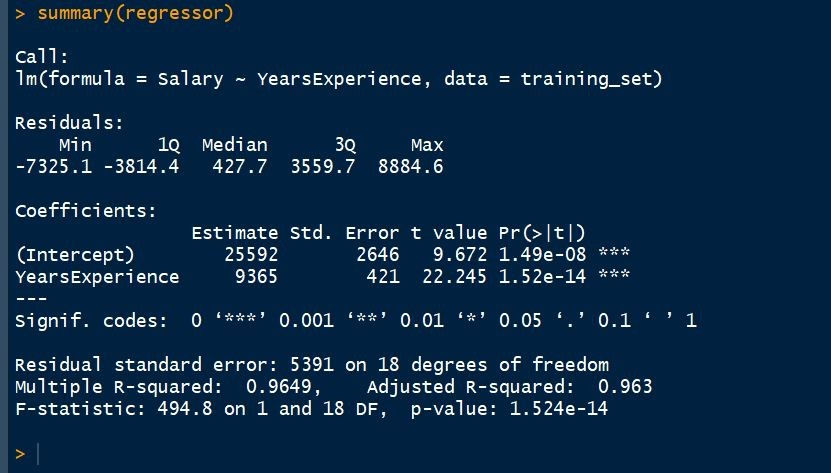
Call: It includes the formula that we have used. So, we can say that Salary is proportional to the Years of Experience and this formula we are applying to our training dataset.
Residuals in a statistical or machine learning model are the differences between observed and predicted values of data. They are a diagnostic measure used when assessing the quality of a model. They are also known as errors. Residuals are important when determining the quality of a model. You can examine residuals in terms of their magnitude and/or whether they form a pattern.
Where the residuals are all 0, the model predicts perfectly. The further residuals are from 0, the less accurate the model. In the case of linear regression, the greater the sum of squared residuals, the smaller the R-squared statistic, all else being equal.
Where the average residual is not 0, it implies that the model is systematically biased (i.e., consistently over- or under-predicting).
Where residuals contain patterns, it implies that the model is qualitatively wrong, as it is failing to explain some property of the data. The existence of patterns invalidates most statistical tests.
Coefficients: This is the most important part that needs to be understood while analyzing the regressor. Coefficients not only describes the values of the coefficients in the simple linear regression equation but it also tells us about the statistical significance of our model and hence describes the efficiency of the model.
Also, we observe the three stars in this section. No star means no significance and three-star means a high statistical significance. This means that the independent variable that is the Years of Experience is highly statistically significant for us and there will be a strong correlation between Salary and Years of Experience.
Another information here is the P-value and the P-value is another indicator of the statistical significance. Lower the P-value is, the more significant your independent variable is going to be. That is there will more impact of the independent variable on the dependent variable. And usually, a good threshold for the P-value is 5% which means that when we are below 5% the independent variable is highly significant and when we are above 5% then it means that it is less significant. Here, it's a very small P-value so it means that the Years of Experience is highly statistically significant and has high impact and high effects on the formula dependent variable.
PREDICTING THE TEST SET RESULTS
Now, it is the time to predict the test set results based on the model that we have made on the training dataset. predict() function is used to do so. The first argument we have passed in the function is the model. Here, the model is regressor. The second argument is newdatathat specifies which dataset we want to implement our trained model on and predict the results of the new dataset. Here, we have taken the test_set on which we want to implement our model. The following is the command to do so:
y_pred = predict(regressor, newdata = test_set)VISUALISING THE TRAINING SET RESULTS
Now, here comes the most interesting part. In this, we are going to visualize the training set results. For doing this we are going to use the ggplot2 library. ggplot2 is a system for declaratively creating graphics, based on The Grammar of Graphics. You provide the data, tell ggplot2 how to map variables to aesthetics, what graphical primitives to use, and it takes care of the details. The following are the commands to do so:
library(ggplot2)
ggplot() +
  geom_point(aes(x = training_set$YearsExperience, y = training_set$Salary),
             colour = 'red') +
  geom_line(aes(x = training_set$YearsExperience, y = predict(regressor, newdata = training_set)),
            colour = 'blue') +
  ggtitle('Salary vs Experience (Training Set)') +
  xlab('Years of Experience') +
  ylab('Salary')
The first we need to do is to install the ggplot2 package. If you already have this package then you don't need to install it. ggplot2 is a system for declaratively creating graphics, based on the grammar of graphics. You provide the data, tell ggplot2 how to map variables to aesthetics, what graphical primitives to use, and it takes care of the details.
The next is geom_point(). The point geom is used to create scatterplots. The scatterplot is most useful for displaying the relationship between two continuous variables. It can be used to compare one continuous and one categorical variable, or two categorical variables. The x-axis will represent Years of experience of the training dataset and the y-axis will represent the Salary of the training dataset.
The next is geom_line(). It connects the observations in order of the variable on the x-axis.
The next is ggtitle(). Good labels are critical for making your plots accessible to a wider audience. Always ensure the axis and legend labels display the full variable name. Use the plot title and subtitle to explain the main findings. It's common to use the caption to provide information about the data source. tag can be used for adding identification tags to differentiate between multiple plots.
xlab() and ylab() are used to label the x-axis and y-axis respectively.
The following is the graph that we will obtain:
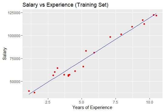
The blue colored straight line in the graph represents the regressor that we have made from the training dataset. Since we are working with the simple linear regression, therefore, the straight line is obtained.
Also, the red colored dots represent the actual training dataset.
Although, we did not accurately predict the results but the model that we have trained was close enough to reach the accuracy.
VISUALISING THE TEST SET RESULTS
As we have done for visualizing the training dataset, similarly we can do it to visualize the test dataset also. The following will be the commands:
library(ggplot2)
ggplot() +
  geom_point(aes(x = test_set$YearsExperience, y = test_set$Salary),
             colour = 'red') +
  geom_line(aes(x = training_set$YearsExperience, y = predict(regressor, newdata = training_set)),
            colour = 'blue') +
  ggtitle('Salary vs Experience (Test Set)') +
  xlab('Years of Experience') +
  ylab('Salary')
The following plot will be obtained:

So, that's it for now. By this practical approach, we have finally completed the simple linear regression. If you like the article then share it. In case of any queries, write in the comment section.
In the next article, we are going to deal with the multiple linear regression and again we are going to practically implement it and see the results.
Article was written by:
Harshit Gupta
e-mail: hgupta7465@gmail.com
Contact No.: +918989203259, +917987355707


Comments